
Who knew a website about bricks could be so engaging?

StoneCycling.com is a great example of well-designed website. If you’re on the verge of creating your own marketing website you should be taking notes. No seriously, I’ll wait while you grab a pad and pen.
I came across StoneCycling on a “best new websites” listicle, many of which I ignore because these lists are usually made up of marketing agency websites or solopreneur designer websites that are 90% style and 10% substance. But StoneCycling truly deserves to be on a best websites listicle for the following reasons:
Well, hello beautiful!
The website is aesthetically pleasing in a Swiss Design, minimalist kind of way. It’s not flashy or burdened with unnecessary design elements. In my opinion it’s exactly what it needs to be, nothing more or less.
The home page opens with a product beauty-shot video that grabs your attention but doesn’t get in the way of the website’s content.
The StoneCycling logo is simple and elegant and the logo’s brick icon is used throughout the website as a design element to distinguish different content areas and break up the design grid.
The earth tone color palette is inspired by the different types of bricks StoneCycling offers and there’s plenty of white space to assist content legibility and lend to the quiet design of the overall layout.
The single typeface used throughout the site is Maison Neue, a humanistic sans-serif from the Milieu Grotesque type foundry. Unfortunately, Milieu’s website is the polar opposite of StoneCycling and I don’t recommend visiting it if you’re prone to epileptic seizures.
One of the real tests of a well-designed website is how it looks and performs on mobile devices. This is often where a website that looks great on desktop browser throws up all over its shoes when you view it on a phone. But StoneCycling doesn’t disappoint in this regard. The design gracefully morphs and contracts to accommodate even the smallest of viewports.
Content, content, content.
Like the old real estate axiom, “location, location, location,” a website is nothing without quality content. Words and images are what compel people to purchase your product or service and, without them, your website is just a beautiful, empty box.
StoneCycling does a good job of chunking their content — creating bite-sized pieces that are easy to distinguish, scan, and digest. And I’ll bet you a large iced coffee there was a very skilled writer/editor involved in the process, making sure the client didn’t try to choke each page with 5,000 words.
The process section of the homepage (Problem/Solution/Result) is a great example of well-written content accompanied by simple illustrations that tell a complete story in a relatively small amount of screen real estate.

The product detail pages are thoughtfully laid out — taking you from beauty shots to product specs to project examples to specific call-to-action choices (order a sample, talk to an expert). Including a sustainability calculator that displays your positive impact on the planet is a great way to engage visitors and keep them on the page. And the longer a visitor stays on your site the greater the chance you can convert them to an action (contact us, sign up, add to cart).
And speaking of beautiful imagery, it’s clear StoneCycling hired professional photographers for their product and location photography. I can’t stress enough how good visual content is often the purchase decision point for customers. Don’t skimp on photography or video. Just don’t.
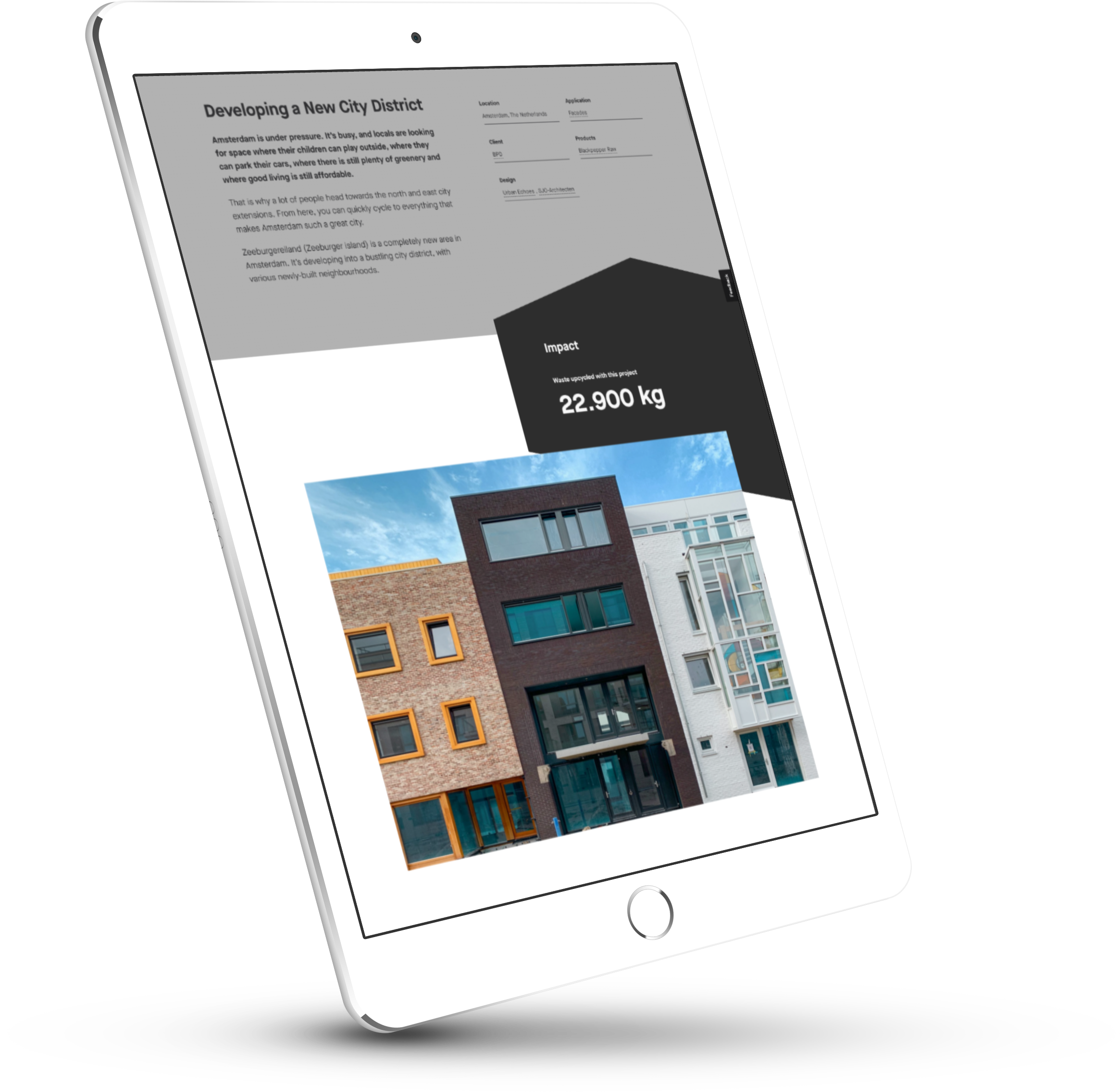
One of my favorite content details is on the project overview page. Next to each project name and location is text and a brick icon that displays the amount of construction waste that was up-cycled. Each project detail page also prominently displays this piece of sustainability data to reinforce StoneCycling’s unique mission.
So, where to next?
One of the aspects about web design that is often overlooked is user flow. Whether a visitor lands on your home page though a direct link or they find themselves inside your site through a Google search, it’s important to intentionally guide them through the website. My friend Chris Butler has written extensively about user flow and how it can turn a good marketing website into a profitable marketing website.
StoneCycling creates a good user flow on their homepage starting with their mission statement and leading you through process, products, projects, and some social proof (who we work with) and providing several entry points into other areas of their site along the way.
The website also does a good job of providing the next choice (related content links, sign up form, cross links between projects and specific products) in order to keep the user engaged. You are never left standing in a content cul-de-sac wondering, “Well, now what?”
Near perfect
I could nit-pick StoneCycling.com and find a few things that I may have done differently, but having been a web designer for over 20 years I understand how difficult it is to produce a quality website that checks all the boxes, especially if the client hasn’t put their complete trust in your abilities (“Make the logo bigger and please add this homepage copy our CEO wrote.”). So my hat is off to the designers who put together this beautiful and engaging website.
Even though I’m design geeking over things like font choices and whitespace, it’s often these subtle decisions that can make or break a marketing website. It pays (literally) to give careful attention to things like visual design, user flow, and good writing when you’re building your own website.