Swoosh, there it is. Part 2
Most graphic designers see design everywhere (good, bad, and bizarre). We can’t help it — it’s in our DNA. Suppressing our desire to evaluate design wherever it crosses our gaze would be like trying to stop the tide from coming in or asking Patriots fans to stop worshipping Tom Brady.
During my summer road trips, I’ve noticed an unfortunate design trend in recreational vehicles (RVs).
In a word, it’s swooshes.
From trailers, to Class Cs, all the way up to luxury motor coaches it’s nothing but swooshes, swirls, and whorls as far as the eye can see. The random decorations adorning the side of these fiberglass and metal boxes on wheels seem to be design afterthoughts (if any thought at all was afforded in the first place). Not to mention most of these swooshes are brown or beige. When did brown become a go-to design choice? (UPS, excluded)
RV design isn’t the only victim of this type of lazy design (see my previous rant about logo swooshes), but once you notice something like this you can’t un-notice it. It’s like when you buy a new car and suddenly everyone else seems to be driving the same car.
When did we lose our design soul?
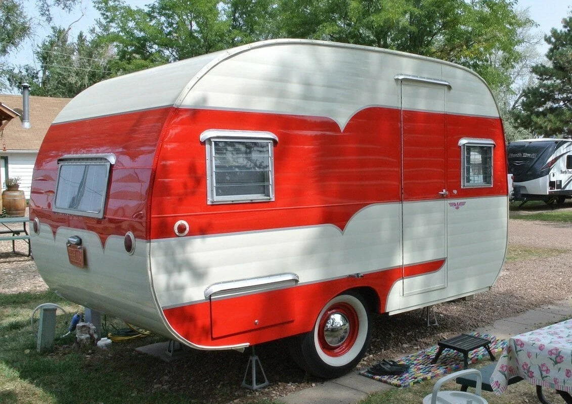
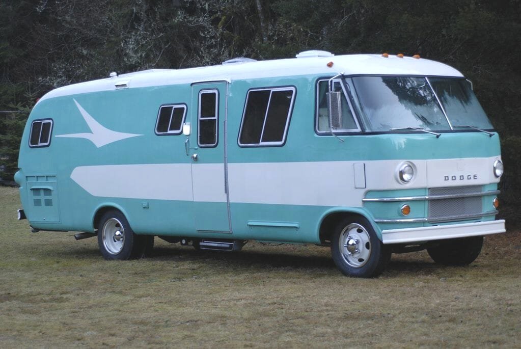
So when did RV designers walk away from thoughtful design and begin phoning it in with swooshes? A quick Google search reveals that it was sometime in the 80s. Before that, you can find trailers and RVs that sported paint schemes and graphics that flowed with and complimented the structural lines of vehicle instead of a bunch of random shapes slapped on the surface.
Some RV manufacturers, like Airstream, are in a class by themselves and produce products that are works of art, with no graphic adornment necessary. And in the world of million-dollar luxury RVs you see very little graphic adornment. I guess you wouldn’t want some random swirls on the side of your 7-figure land yacht clashing with the $100,000 Mercedes that slides out of the back of your motor coach.
Some humble recommendations
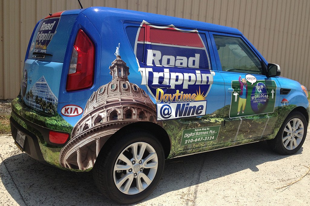
Airstreams and 3-million dollar motor coaches aside, there’s no reason why the middle-class RV market can’t be more imaginative when it comes to creating graphics for their RVs. If you’re going spend the time and money applying random swooshes on the side of a fiberglass box, why not go the extra step and create truly unique vehicle wraps? There’s plenty of inspiration in the marketplace: small businesses from landscapers to foodservice to dry cleaners are grabbing people’s attention with unique and well-designed vehicle graphics.
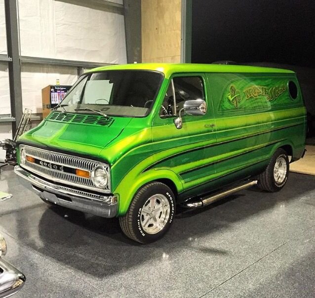
Or you could reach back a few decades to custom panel van design for a bit of retro inspiration. Your space unicorn or lime green flame-emblazoned RV would be the talk of the campground. You don’t necessarily have to go full-tilt 70s with shag carpeting or lava lamps but anything would be better than one more brown swoosh rolling down the interstate.
Whether you’re in solidarity with my struggle against swoosh design, think this is much ado about nothing and I should be focused on more important things, or simply have a swoosh rant of your own, feel free to email me or share your thoughts in the comments section below.


