Sometimes All You Need is a Refresh
Rebranding an organization is a significant undertaking and can oftentimes be anxiety-inducing for a business owner who has a lot of emotional equity invested in their logo. But sometimes a complete rebrand is not necessary — a brand refresh will do the trick.
What’s the difference between a rebrand and a brand refresh? You can compare it to building a house from the ground up vs. renovating a house.
A brand refresh is appropriate when your brand has a solid mission, vision, and values but your brand identity needs some tweaking to have a more contemporary look, keep pace with current marketplace trends, or reworked for better readability and reproduction. Most established brands have gone through at least a few brand refreshes during their existence: Starbucks, Mastercard, and Southwest Airlines, to name a few.
Working in tandem
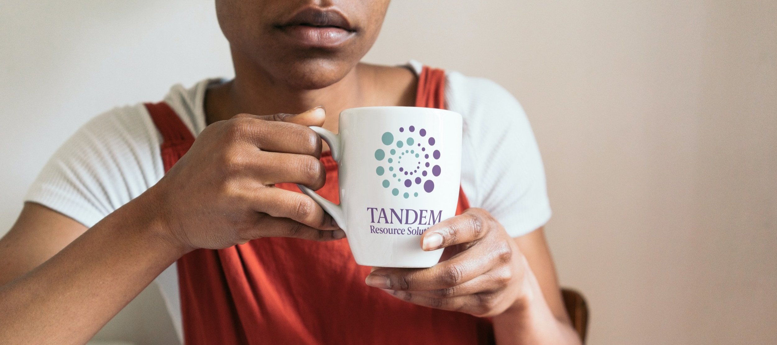
A couple of years ago, I guided a client through a brand refresh. Tandem Resource Solutions is Colorado-based, woman-owned administrative recruitment firm and virtual assistance (VA) agency, that specializes in pairing assistants with business owners and leaders, to create amazing, long-lasting, valuable partnerships.
The owner, Bonnie, asked me to help freshen up her brand identity. She liked the “swirling dots” graphic and the colors but rest was open for an update.

Reworking the typography
The first element I addressed was the logotype. The sans serif font looked uninspired next to the swirling dots and the scale of the letterforms next to the graphic needed a better balance. I decided a serif font would create a nice contrast to the swirling dots and I chose Berlingske Serif for its classic look and easy readability. I also love the rounded serifs of some of the lowercase letterforms like the “c” and the “r” and how they echo the swirling dots of the graphic.
Adjusting the focus of the logotype
The original Tandem logotype gave equal weight to all three words but “tandem” best embodies Bonnie’s mission statement and reinforces the yin/yang relationship represented by the swirling dots graphic. Placing “resource solutions” underneath also allowed me to make the overall identity more compact and visually balanced.
For the “TRS” monogram version of the logo, I pulled the initials out from the center of the swirling dots for a better balance between the letterforms and the graphic and for improved readability.
Balancing the logo
Bonnie wanted to keep the swirling dots graphic and I concurred, but the way it was drawn felt clunky and the tight spacing between some of the dots created visual “hotspots” that would trap the eye as it moved over the graphic. I removed a few of the dots and adjusted the overall spacing to make the graphic more visually balanced.

Creating an identity system
The original Tandem logo contained two colors, a purple and a teal. I expanded the palette with two neutral earth tones, a tan and a warm gray, that could be used as compliments to the more dynamic purple and teal.
While the font I chose for the logo complimented Bonnie’s brand personality, I wanted to provide some typographic alternatives for everyday use. I selected two free Google fonts (Lora and Lato) that work well alongside the refreshed logo.
I also encouraged Bonnie to use the swirling dots as a standalone graphic element and extend her refreshed brand into merchandising and social media templates.
“When I found myself in need of creating a bigger, better and more exciting visual brand, I did not hesitate to reach out to Justin. I thoroughly enjoyed the process. He allowed me to hold on to anything that was near and dear to me, like the basic look of my logo and my company colors. Ultimately, we came upon a brand that utterly represented me, my business, and intended audience to a tee!”
