White Space Is Not Empty Space
One of the most challenging requests I get from clients when reviewing design is, “Can you fill that empty space with something?” Despite explaining that white space (perceived by some clients as “empty space”) actually serves a purpose in the design, the client often persists until the page is filled with content to their satisfaction.
It’s times like this when I wonder if being a trash collector would have been a better career choice. No one runs out to the curb at 6:00 am and art directs how the trashcans are being emptied into the back of the garbage truck (except for you, Karen).
I don’t blame my clients for being unaware about the importance of white space in design. I’m sure my mechanic doesn’t blame me for being ignorant about the importance of ball joints or brake lines when I ask her how long I can continue to drive my car before the situation is really dangerous. Her answer is usually, “Last week.”
So what’s an effective way to illuminate my clients about the importance of white space in design?
I could write 1500 words about how white space:
provides structure and aesthetic balance for elements on a page
creates a “resting place” for the eyes (and brain) in the midst of dense content
helps distinguish one piece of content from another
can emphasize and highlight a visual element when generously surrounding it
makes scanning and digesting long passages of text easier
But I won’t.
Instead, I ask you to consider the following two pieces of music.
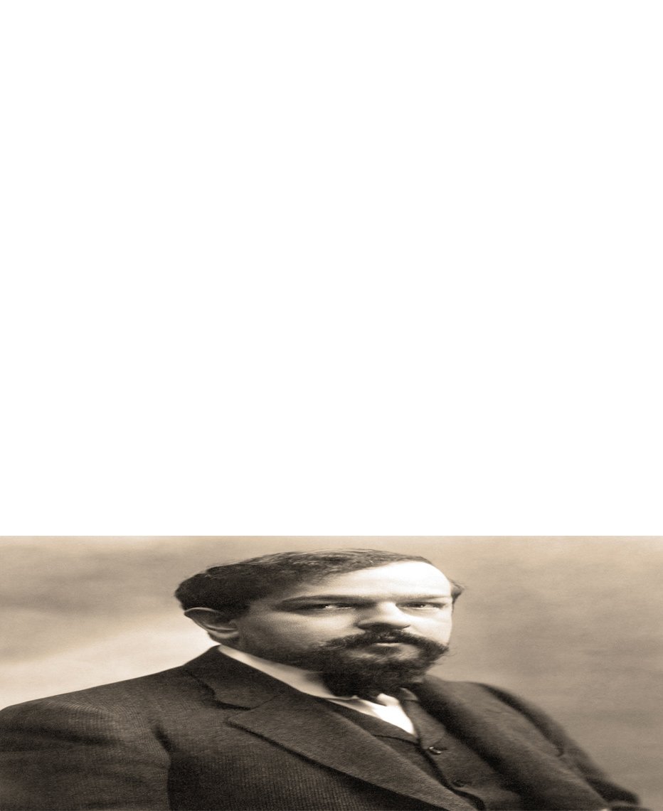
The first one is an excerpt from “Clair de Lune,” a quiet, contemplative, and slightly melancholy piece of music written by Claude Debussy.
The second piece is an edited version of “Clair de Lune” with all of the rests (or white space) removed. A big thank you to my son, William, who masterfully edited the audio file.
My mission as a brand strategist is to help entrepreneurs clearly communicate their authentic brand to the right audience and do it in a manner that is aesthetically pleasing. One of the ways I accomplish this is by using white space effectively. The music sample in which I removed all of Debussy’s “white space” is technically still his music; it contains all the same notes in the same order that he composed them. But it clearly doesn’t communicate the same tone or contain the nuance of the unedited piece.
So the next time you see “empty space” on the page don’t assume it was an oversight by your designer but trust they have carefully considered the white space.


