How I Designed a Face for a Photographer
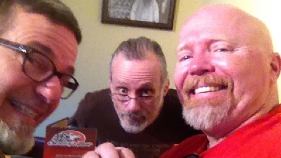
The three amigos on a road trip in 2014. That’s Bill on the right.
How would people recognize you without a face? It’s the part that other people use to distinguish you from every other person on the planet.
Your company’s logo functions the same way. It’s a trigger point for customers’ memories of their last experience with you.
But your logo can also set up expectations for prospective customers of what it might be like to use your product or service. Chase Bank’s logo gives you the impression they’re a well-established, professional institution and your money is safe with them. The informal personality of Ally Bank’s logo says, “Hey, forget those stiffs at Chase and come over to a friendly place to do your banking.” At least that’s the way I see it.
Last week, the podcast I co-host published an episode entitled, “How to Develop an Authentic Brand,” in which I tell the story of how I created a logo for a friend of mine (and professional photographer), Bill Parmentier. Below are some highlights but you should really go listen to the episode to get the full story.
Challenges
Bill didn’t have an existing brand because he had just started his company, W. Parmentier Photography. He had some generic business cards from an online vendor to tie him over until I could design a logo that would help him stand out from a crowded field of photographers.
Goals
Bill wanted to stand out from other photographers so we decided to steer clear of any camera-related symbols and also avoid using his signature as the logo. A lot of photographers do this, which makes it really difficult for their brand to stand out.
The logo needed to scale as Bill’s business grew so I kept thinking about all the different places his logo might be applied (business cards, merchandise, social media, vehicle graphics, etc.). I once had an art school instructor tell me, “If your logo design can’t be carved out of ice, start over.” That might be a bit of hyperbole but his point was to take the logo design through as many different scenarios as possible to see if it holds up.
Process
Bill sent me his business plan and some favorite photography websites. Most importantly, he provided some samples of what he DIDN’T want.
Because I’ve been friends with Bill for 17 years it was easy to assess his personality, which I wanted the logo to reflect. It also allowed me to present ONE solution; something I rarely do but I felt confident about my design.
The heart of the logo is a stylized avatar of Bill’s face, which projects a warm, human connection. While he’s definitely a serious professional when it comes to photography, Bill is also a bit of a goofball so the expression I chose has some of that essence.
At first, Bill wasn’t sure if he wanted his face plastered all over his business but I told him to live with it for a week before providing any feedback.
Outcome
After a week, Bill decided he loved the new logo as well as all of the marketing applications I had designed. I handpicked the materials for his business cards and other collateral because I didn’t want a great logo diminished by crappy printing.
Over the years, Bill has received many compliments on the originality of his logo and he told me he appreciates the thinking and the process that went into developing it.
You can check out the project in my portfolio section. And don’t forget to head over to the Marketing Essentials Podcast to hear the full story.


