Clear Water Plumbing
Joel Charette is not just another plumber with a truck and a pipe wrench.
Joel is passionate about water. More specifically, water quality. It permeates every service he provides to his customers: from installing energy-efficient boilers, to recommending the best combination of water softening and filtration systems, right down to replacing a water-wasting leaky toilet. Because Joel grew up with poor quality drinking water and realized early on how much of an impact it has on people’s health and well-being, he has made providing the best water treatment and delivery systems to residential customers a big part of his brand’s “why.”
Lost in translation
Joel’s original brand identity wasn’t communicating his “why” in a way that was flexible and scalable. Like most entrepreneurs who wear all the hats at once, Joel started his company on a small budget and used resources that were close at hand to design a logo and begin applying it to all of his marketing channels (website, business card, vehicle graphics). But his photographic-based logo didn’t translate well into all mediums (like embroidered shirts and hats).
Joel and I spent several weeks discovering his authentic brand through Zoom interviews; talking about his vision for the future of his company, its mission, and the non-negotiable core values that Joel had developed partly through experiencing the darker side of the plumbing and heating industry at large.
Using Joel’s brand strategy as a starting point, my task would be to translate the essence of his original logo into a new brand identity that could grow and adapt as his company grew and expanded.
Joel’s old logo looked ok in some applications, like his website, but got lost in translation in others, like embroidered apparel.
Turning water into… well, better water
I started with a quick survey of Joel’s current marketing to see how his logo was being used and reproduced. One of his print vendors had added a water droplet to Joel’s existing logo because he thought it looked good. Normally I would go on a mini-rant about printers and designers staying in their respective lanes but, in this case, the water droplet gave me an idea about the direction I could go with the new identity.
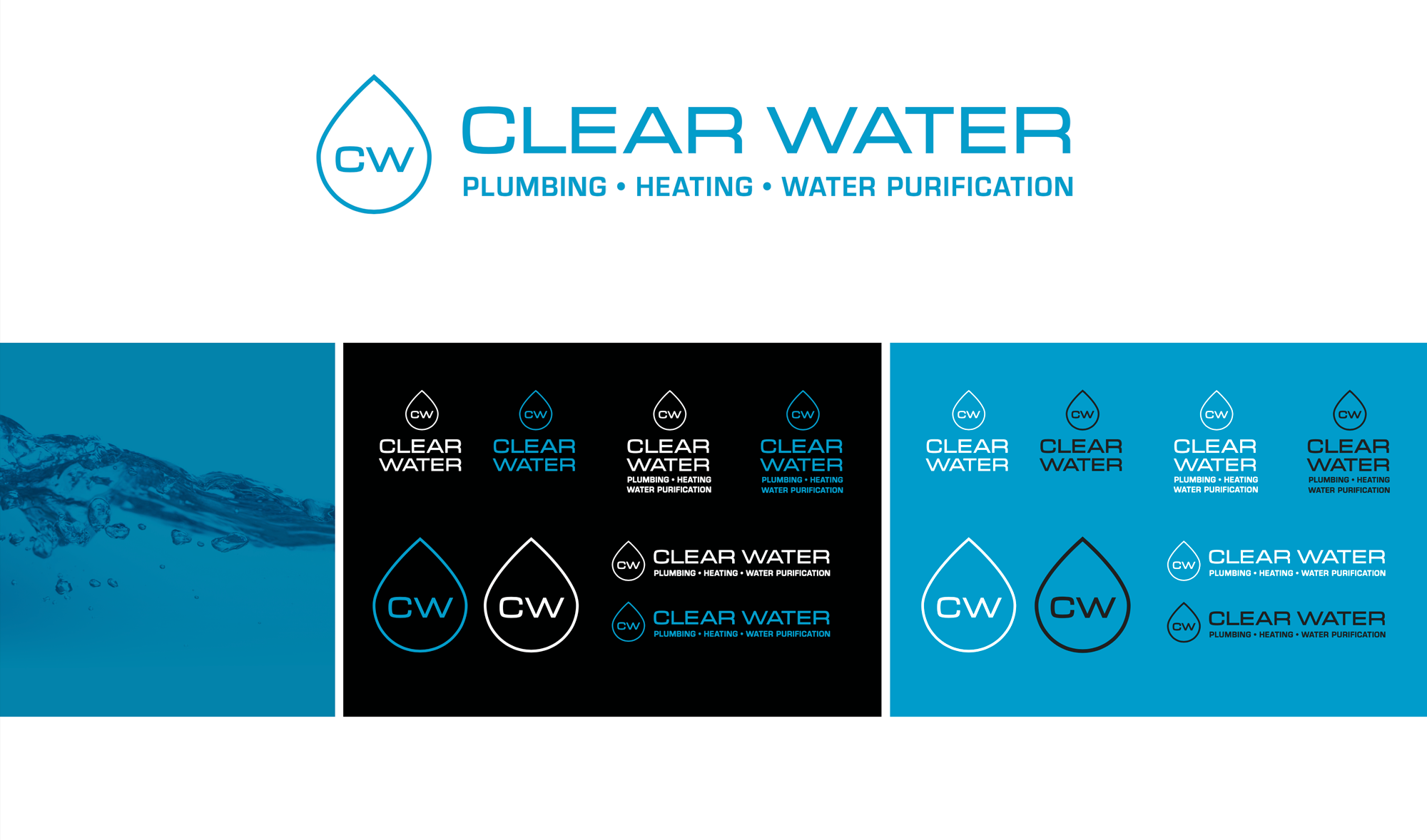
I decided to keep the wide sans-serif font Joel was using but provide a clearer hierarchy for overall logo; emphasizing “Clear Water” and tucking the service identifiers underneath. After all, Joel’s mission was about providing quality water delivery so that should be the most prominent part.
I made the water droplet symmetrical in shape to reduce the changes anyone would read it as a gas flame. The outlined shape of the droplet would mimic the thin font for the logo and also become a visual brand component on its own with the “CW” initials inside of it.
The results
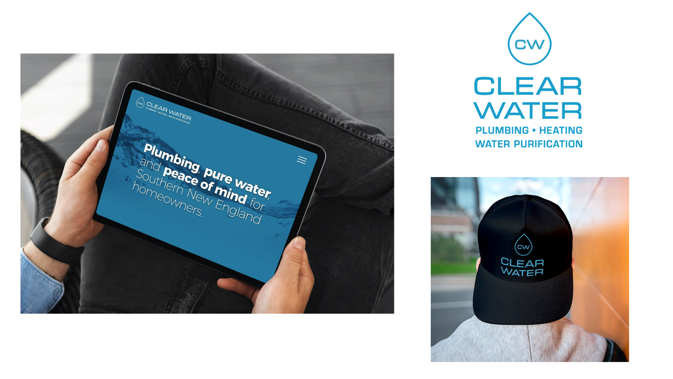
Joel was so pleased with the outcome that he printed new shirts and hats almost immediately. Because I had included the photographic water element from his original logo into the new identity system, along with using the same font, the new brand identity felt more like a evolution of Joel’s original logo rather than something completely different.
The new “CW” mark looks great on hats and has instant visual recognition, even from a distance. The Sea Blue that we selected as Clear Water’s signature color stands out from the competition and reinforces the idea of water purity, an important part of Joel’s brand and mission.


