BRADY LAW
Two Bradys, One Bold Brand: How Brady Law United Tradition and Modern Design
Brand Development | Website Design
Brady Law
Jim and Steve Brady, who ran their own respective law practices, decided to merge in 2023 and needed a fresh brand identity and a new website. Jim’s area of expertise was personal injury, workers comp, and real estate law while Steve practiced mostly criminal law. All of these legal services would be brought together into one new firm.
New brand
I began the project by focusing on the brand. Jim Brady had an existing logo with his initials centered inside a shield and the entire thing dipped in metallic gold (definitely a relic from the early 2000’s). However, I wanted to preserve some of the logo’s essence so that it would be more of a brand evolution rather than something completely new.
Jim had provided me a napkin sketch of his family coat of arms and I decided that was a good place to start since the crest included a shield which I could bring forward to the new logo. A single letter monogram would be most readable (especially at small sizes) so I created a double-stroked “B” to represent the two “Bradys” combining into a new firm. Jim’s coat of arms was comprised of a shield (strength) with a rising sun (hope) affixed to the top and an open hand (faith, justice) below the shield.
Jim and Steve immediately gravitated to this logo design but Jim asked me to remove the sun from the top of the logo. I was a little disappointed because I really liked the way the sun looked but, ultimately, it improved the logo — simplifying it visually and reducing the number of symbols a viewer would have to digest.
New website
The goals for the new website, aside from combining content from Jim and Steve’s old websites, was to create a brighter look & feel. The old Brady Law site used dated imagery with a musty-looking color palette and Jim wanted the new site to project the positivity and hopefulness that matched the personalities and temperament of his legal team.
Old Brady Website
Redesigned Brady Website
The business consultant that Jim was working with hired a great copywriter to rework the site’s text and a professional photographer was brought on board to create new imagery. The aim was to have a fresh new look but also emphasize Jim and Steve’s expertise, experience, and care for their clients. Jim had amassed an enormous collection of client testimonials, which I strategically placed throughout the site. Each practice area contained a testimonial and related blog articles, as well as new videos from Jim and Steve discussing their practice philosophy.
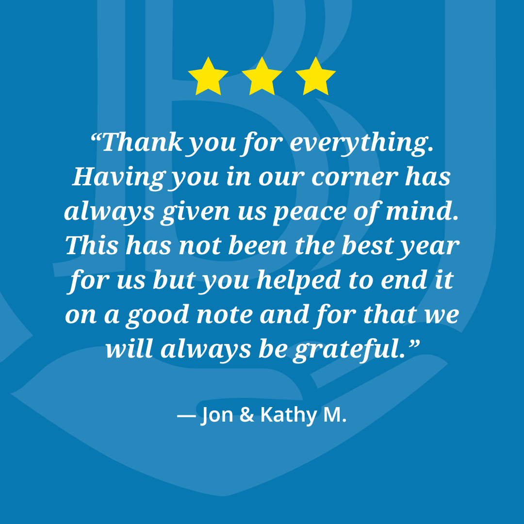
Once the website design was complete, I worked with Jim to create a series of social media graphics they could use on Instagram and Facebook. These graphics would apply the new Brady brand to specific post content like client testimonials, blog post highlights, “Did You Know” nuggets of legal expertise, and holiday reminders.
“My law partner and I wanted a fresh and different website for our practice that would stand out from other websites. We met with Justin and knew during our initial meeting that he was the person for our project — he was always responsive and the entire process was a pleasure. I could not be happier with the results. The site is fantastic. More importantly, the feedback from people about the website has been amazingly positive.”
The project took about seven months from its inception and the Brady team were extremely happy with the new brand and website. To set them up for continued success, I provided Jim’s staff with a brand guide to maintain a consistent look & feel across all of their marketing materials as well as several how-to videos so they could maintain the blog and make simple content edits as necessary.


