
Advanced comfort systems
From junior high to high impact: How a home comfort company modernized their brand without losing their roots
Brand Refresh
Advanced Comfort Systems (ACS) is a Rhode Island based, second generation family heating company that specializes in solar, geothermal, and radiant floor heating. The owner, John, started the company with his dad in 1994 and eventually brought his daughter, Jillian, on board to help with marketing.
Jillian contacted me about redesigning their brand identity, which she had created in junior high school. Hey, no judgement from me. When I was in junior high I was drawing KISS logos on the cover of my math book, so kudos to Jillian for tackling a corporate logo design at such a young age. Regardless, all parties involved agreed it was time for an upgrade.

A New York-based marketing professional named Bob was already involved in the project when I came on board and he provided me with ACS’ new mission and vision statement, positioning, and tagline. My task was to develop a brand identity that would incorporate multiple versions of the new logo, a suite of branded products, new typography, and a new color palette.
Showing some love to Jillian’s o.g. logo
I wanted to pay homage to Jillian’s logo by incorporating some of the original elements in the new logo. I began with black and white concepts because it would keep the focus on the logo without the distraction of a color palette. One of my art school professors had drilled into my head that a successful logo could stand on its own in black and white, without needing to be propped up by shading or a color palette. He was a bit of a purist, but he’s absolutely right.
Three initial concepts for the new ACS logo. The “house” concept was selected as the winner.
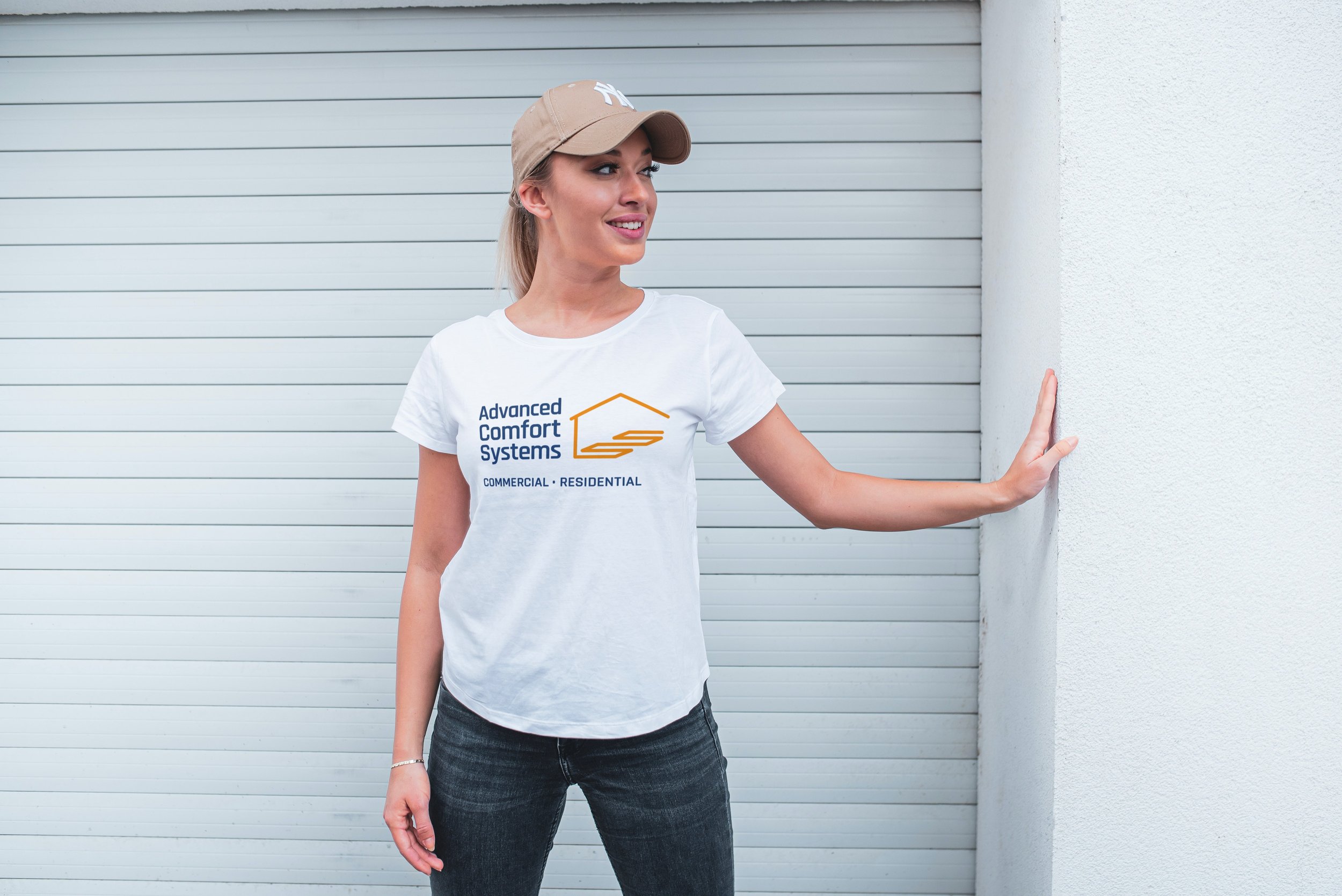
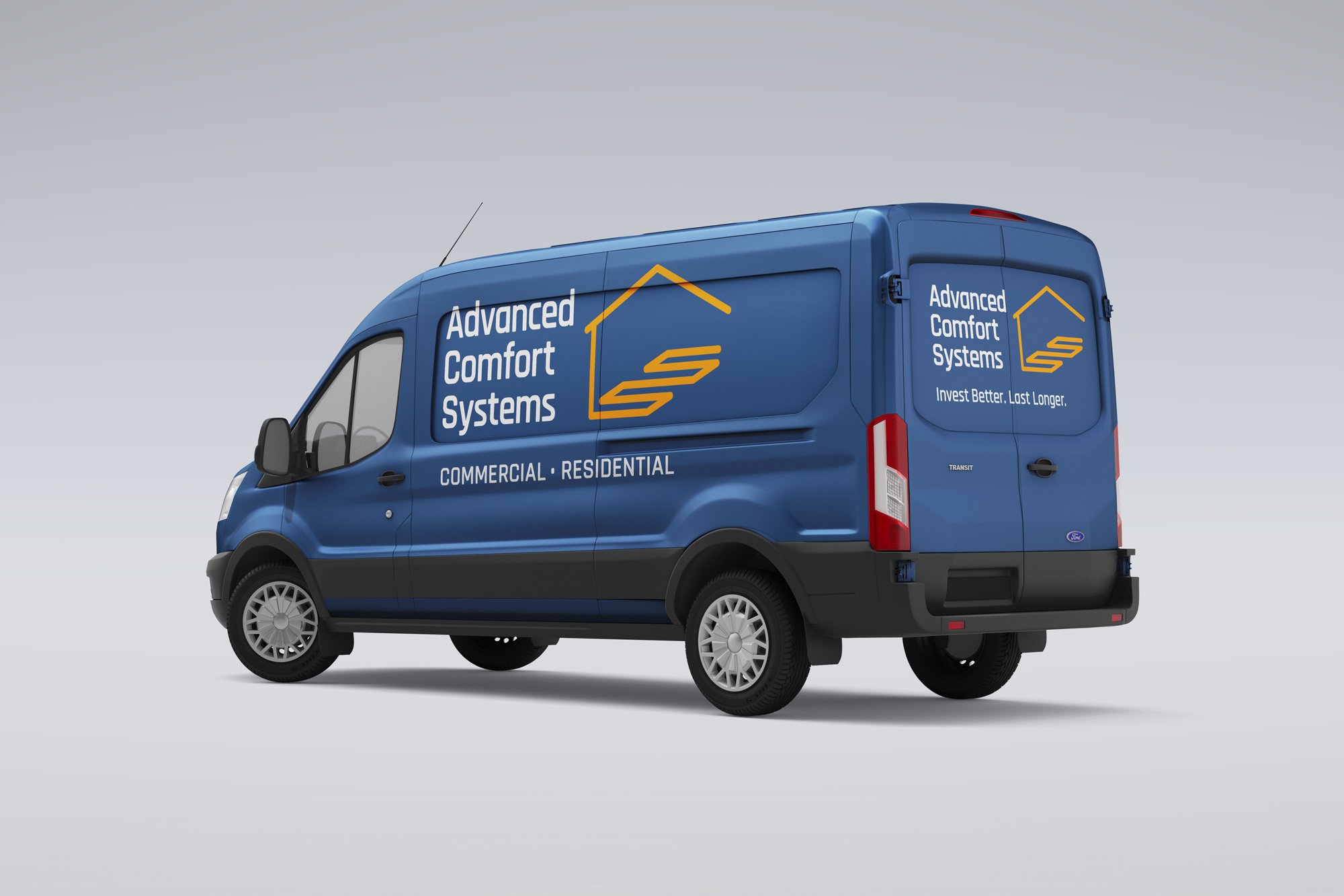
The “house” concept was chosen as the winner and I moved ahead with creating several variations: one with the new tagline (Invest Better. Last Longer), one with a Commercial/Residential identifier line, one with a holding box, and a monogram variation for when space was limited. As with the primary concept, all of these were created in black and white.
That’s a hard “no” on the puddle icon
ACS has five product offerings and Jillian wanted those to be part of the brand family, as well. I used the same logo font and created a unique icon for each service so they could be identified at a glance. Selecting an icon that accurately represents a specific product or service can be a real challenge, especially if it’s not accompanied by identifier text. Fortunately, that wasn’t the case with ACS.

However, the Snowmelt icon generated a lot of debate among Jillian, myself, and Bob (the marketing guy). I suggested a snowflake since it was already in the name but Jillian felt strongly that the icon should communicate “melting” as well. An icon of a puddle would look like someone had an accident on the floor so I opted to create a split icon, with a snowflake on the left and water droplets on the right which would imply a transition from one state to the other. Everyone was happy.
Color, finally!
Once all of the brand identity iterations were approved, I began to explore color options and presented three options to the ACS team: a multi-toned blue palette, a multi-toned green palette, and a blue/orange palette. The blue/orange palette was selected as the winner for its contrasting colors and I expanded the palette by adding two warm grays.
I also created some mockups so Jillian and the ACS team could envision the many different ways the new identity system could be applied. Jillian’s dad was enamored with a retro Snowmelt ad I had created and, since he and I are about the same age, we spent the better part of one Zoom call going down Gen-X memory lane.

Handing off the baby
Jillian, her dad, and Bob the marketing guy were all very happy with the outcome of our collective efforts to rebrand Advanced Comfort Systems. I handed off a suite of logo files, an 18-page brand guide, and a “master file” of the entire identity system. This last deliverable was a specific request by Jillian so she could access the original files in case some small change needed to be made, like adjusting the tagline. I have to admit that handing off source files to a client felt like handing over one of my children. In other words, anxiety-inducing. But I’m confident that Jillian will handle her new brand with love because, the truth is, it’s her baby now.
“Justin as a person is welcoming and humble. Justin as the designer, is badass. From start to finish, there was no confusion, no stress, and no hidden fine print. He always delivered from the ideas we presented, making us feel more connected to the final product. Overall, the process could not have gone any smoother!”


More Case Studies